:quality(75))
:quality(75))


:quality(75))
From the thousands of options available, designers constantly ask themselves which fonts they should use: do I stick to a Serif or a Sans Serif? Combine the Serif + Sans Serif, Script + Serif, Serif + Serif, or Script + Script?
There’s no easy answer to this. But at its core, font pairing is the art of harmonizing different fonts to create cohesive and striking designs.
“Good typography, first, makes words readable. At its best, it does something more: it helps express the animating spirit of the ideas behind the words.” – Michael Bierut, Graphic Designer
In this blog post, we’ll discuss everything you need to know about font pairing and how to do it effectively. Together, we will explore the psychology behind fonts, dissect the principles of harmonious font pairing, and showcase practical applications.
So, if you're ready to transform your design projects, captivate your audience, and leave a lasting impression, let's start exploring what the world of font pairing involves.
Jumpstart your ideas with Linearity Curve
Take your designs to the next level.
The intricacies of font pairing
Whether crafting a logo, designing a website, or curating a marketing campaign, the fonts you choose can speak volumes about your brand's identity and personality. Understanding the art of font pairing is not just a skill; it's a strategic advantage in branding and marketing.
To make font pairing easier, we've compiled a handy glossary of key terms you'll need to know.
| Term | Definition |
|---|---|
| Typeface | A family of fonts with consistent design characteristics, including various styles (regular, bold, italic, etc.) within the family. For example, the Archivo typeface family contains the Archivo Narrow font style. |
| Font | A specific variation or style within a typeface family, such as Arial Bold or Times New Roman Italic. |
| Serif | Small decorative lines or strokes added to the ends of characters in certain typefaces, often used for a traditional and elegant look. |
| Sans-serif | Typefaces without decorative, geometric forms or strokes at the ends of characters. Sans-serif typefaces are known for their modern and clean appearance. |
| Kerning | The adjustment of space between individual characters to achieve optimal visual balance and readability. |
| Leading | The vertical space between lines of text, essential for maintaining readability and visual harmony. |
| Tracking | The uniform adjustment of space between all characters in a block of text to achieve the desired spacing. |
| Hierarchy | The arrangement of text to create visual distinctions in importance, commonly created using headings, subheadings, and body text. |
| Serif typefaces | Font families that include serifs, often used for traditional and formal design styles. |
| Sans-serif typefaces | Fonts without serifs, preferred for modern and minimalistic design styles. |
| Kerning Pair | Specific space adjustment between two characters to improve their visual alignment. |
| Ligature | A special character that combines two or more letters into a single, aesthetically pleasing form. Common ligatures include: Th, ff, ft, fi, st, et, and the ampersand glyph. |
| X-height | The height of lowercase letters without ascenders or descenders, often used to determine font legibility. |
| Baseline | The imaginary line on which the characters sit, ensuring uniform alignment in a line of text. |
| Ascender | The part of a lowercase letter that extends above the x-height, as seen in letters like 'b' and 'h'. |
| Descender | The part of a lowercase letter that extends below the baseline, as seen in letters like 'g' and 'y.' |
| Point | A unit of measurement in typography, equivalent to one seventy-second (1/72) of an inch, used to specify font size. |
| Display fonts | Typefaces designed for use at large sizes, often used for headlines, logos, or decorative purposes. |
| Body text | The main text content of a design, typically set in an easily legible font. |
| Script fonts | Typefaces that mimic handwritten or calligraphic styles, adding a personal and decorative touch. |
| Web fonts | Fonts specifically optimized and licensed for use on websites to ensure consistent rendering across browsers. |
| Typeface pairing | The art of selecting and combining two complementary fonts or typefaces for a harmonious design. |
Did you know that using Linearity Curve’s powerful tools and resources is one of the first steps toward empowering designers like you to make better design decisions?
Whether you're a seasoned pro or just starting your design journey, Linearity Curve will amplify your creative potential and make designing faster, simpler, and more enjoyable than ever before.
3 basics of type-centric design
Type-centric design, often referred to as typography-focused design, is a creative discipline that places fonts and text at the forefront of visual communication. In this design approach, typography becomes more than just words on a page; it transforms into a powerful design element that conveys emotions, messages, and aesthetics.
Type-centric design embraces the art of selecting, arranging, and styling fonts to create impactful compositions. Whether crafting captivating headlines, designing elegant logos, or shaping the user experience on a website, type-centric design is where letters become artworks, and every character carries meaning.
Let’s look at the fundamentals of type-centric design below:
1. Font classifications
For many designers, typography is the foundation of their design. Fonts come in various classifications, each with unique characteristics. Serif fonts, like Garamond and Baskerville, convey tradition and elegance.
Sans-serif fonts, such as Helvetica (yeah, we know), Bebas Neue, and Roboto Mono, evoke modernity and simplicity.
Script fonts like Copperplate add a personal touch, along with more modern cursive fonts like the Debby brush typeface. Display fonts like Futura will also grab the viewer’s attention with bold, easy-to-read styles.
2. The power of contrast
Contrast is a fundamental element in font pairing. Combining fonts with contrasting characteristics creates a dialogue between the conversational elements of your work.
For instance, pairing a bold font with a delicate script or cursive font can make your design dynamic and engaging.
3. Size and hierarchy
Consider font size and hierarchy in your design. Use larger, bolder fonts for headings and titles, like ‘Display Fonts.
Opt for smaller, narrow typefaces for legible body text when reduced to smaller sizes and weights, ensuring a clear visual hierarchy and enhancing readability.
Step-by-step guide to font pairing
The decision-making process when pairing fonts is mostly about making aesthetic choices that create harmony with the rest of your design. But, a few practical steps shouldn't be overlooked:
Plan and purpose
Like all good design work, the trick to excellent font pairing is planning.
Start by working out what you want to say with your design and how you would like to say it. Consider the tone of your communication—is it formal or informal? Assertive or friendly?
Research a few fonts that work with the purpose of your project, and start considering how each of them works towards communicating the plan you have in mind.
Experiment with options
Contrast is the cornerstone of effective font pairing, so start experimenting with how you can use the fonts you have earmarked to their best effect.
We recommend selecting fonts with contrasting traits, such as weight and style. This contrast adds depth and visual appeal to your design and helps establish your communication flow.
For example, pair Beirut's bold, heavyweight look with the delicate, script-like elegance of Snell Roundhand—both fonts can be accessed for free in Linearity Curve’s incredible font library. This combination balances strength and romance, making your design captivating and whimsical.
Organize and emphasize
The human eye groups similar objects, finds patterns, and simplifies complex images. In typography, establishing a clear hierarchy in your design using a more prominent, bolder font for headlines and titles is one way to help the eye process information.
If you're designing an Instagram post, for example, we suggest using a bold font for the event title to grab attention and then a smaller font for event details. This hierarchy guides the viewer's focus to the most crucial information.
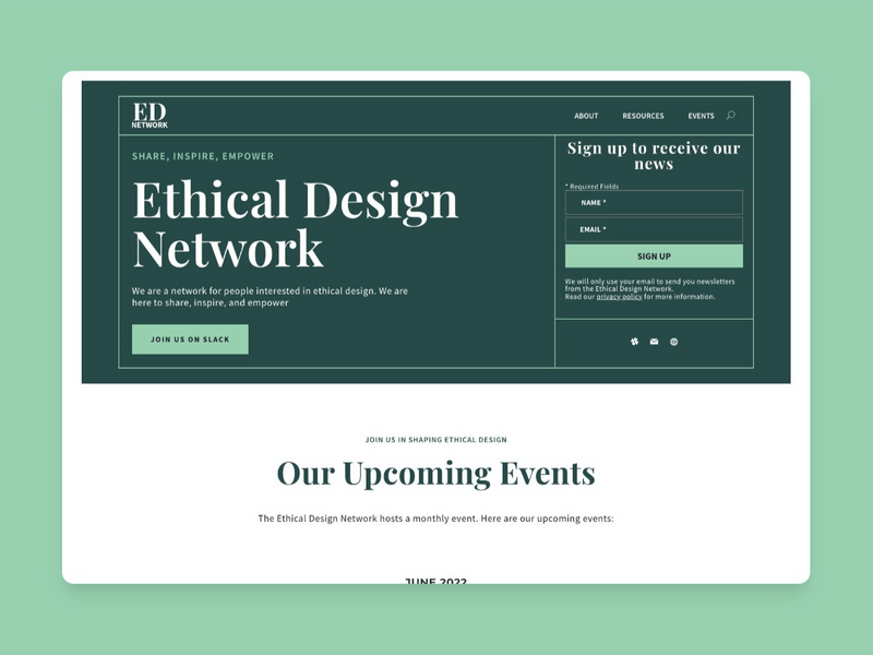
We love how this hierarchy is established in Linearity’s Reaching Right template, where Baskerville is used as a headline and balanced with Helvetica for the body copy.
:quality(75))
Simplify
Simplicity leads to elegance. While it might be tempting to go further with numerous fonts, it's best at this point to limit yourself to two or three per design (though we try to draw the line at two excellent fonts). This restraint maintains consistency and cohesiveness.
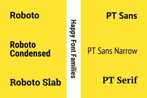
You can also create a balanced and harmonious composition by sticking to a small selection of fonts. If you're looking for a safe bet, choose fonts from the same typeface family. Typeface families offer various styles, such as regular, bold, italic, and condensed. This uniformity ensures a cohesive and visually pleasing design.
For example, you can pair Montserrat Bold with Zilla Slab Regular. These fonts belong to the same typeface family and work seamlessly together, presenting a unified appearance in your design.
Our Monochromatic Wave template explores the Helvetica font family’s versatility, creating a wonderfully minimalist typographic visual. Check out the Monochromatic Wave template below:
:quality(75))
Test and experiment
Font pairing is subjective and context-dependent. What works for one project may not work for another project. So, testing and experimenting with different font combinations is crucial to find the perfect match for your design.
We suggest creating prototypes and mockups using various font pairings and then showing them to a diverse audience of peers or friends for feedback. This iterative process allows you to discover unique and effective font combinations that resonate with your audience and might surprise you, too.
Understand how to use Linearity Curve’s Text Tool
Harness the power of a digital text tool for your font pairing. Among Linearity Curve's most valuable tools, the Text Tool is critical in bringing designers' visions to life.
Harness the power of a digital text tool for your font pairing. Among Linearity Curve's most valuable tools, the Text Tool is critical in bringing designers' visions to life.
The text tool on Linearity Curve is a versatile feature that allows users to add and manipulate text within their design projects easily. This tool allows users to insert, edit, and style text, including adjusting font size, color, alignment, and more.
It provides a user-friendly interface for creating beautifully formatted text elements, making it a valuable asset for designers and creatives looking to enhance their designs with typography.
Learn to use the Text Tool
Visit our Academy for free marketing design courses.
Trust your instincts and have fun
Font pairing is a blend of art and science. While guidelines and principles exist, trusting your instincts and enjoying the creative process is just as important as following the rules.
:quality(75))
Font pairings to inspire logo design
In logo design, every element must align with the brand's identity and message. Font pairings play a critical role in establishing this alignment. Fonts convey the brand's personality, values, and uniqueness.
Consider a logo for a law firm; a classic sans-serif font like Century Gothic as the primary typeface paired with a sleek serif like Playfair Display as the secondary typeface can project professionalism and trustworthiness.
This combination of classic typefaces resonates with the brand's commitment to reliability—a serious combo for serious business.
A serif font for logo design is always a good idea for something less romantic. Use elements of the same font family, like the font's bold, italic, and lightest weights, to express the font's versatility and the company's message of ingenuity. Explore the Montserrat font here—one of the most versatile modern fonts.
Combining fonts like Josefin Sans and Abril Fatface in your design balances elegance and modernity but still packs a bit of a punch and has some spice. It's an excellent choice for businesses aiming to simultaneously convey a sense of innovation and tradition, like a doctor or engineer.
5 perfect font pairings
Perfect font pairing 1: Oswald and Lato
A great example of a Serif + Serif pairing. Strong, but approachable.
Perfect font pairing 2: Roboto Regular and PT Sans
Another classic Serif combo. This time a little more bold and serious.
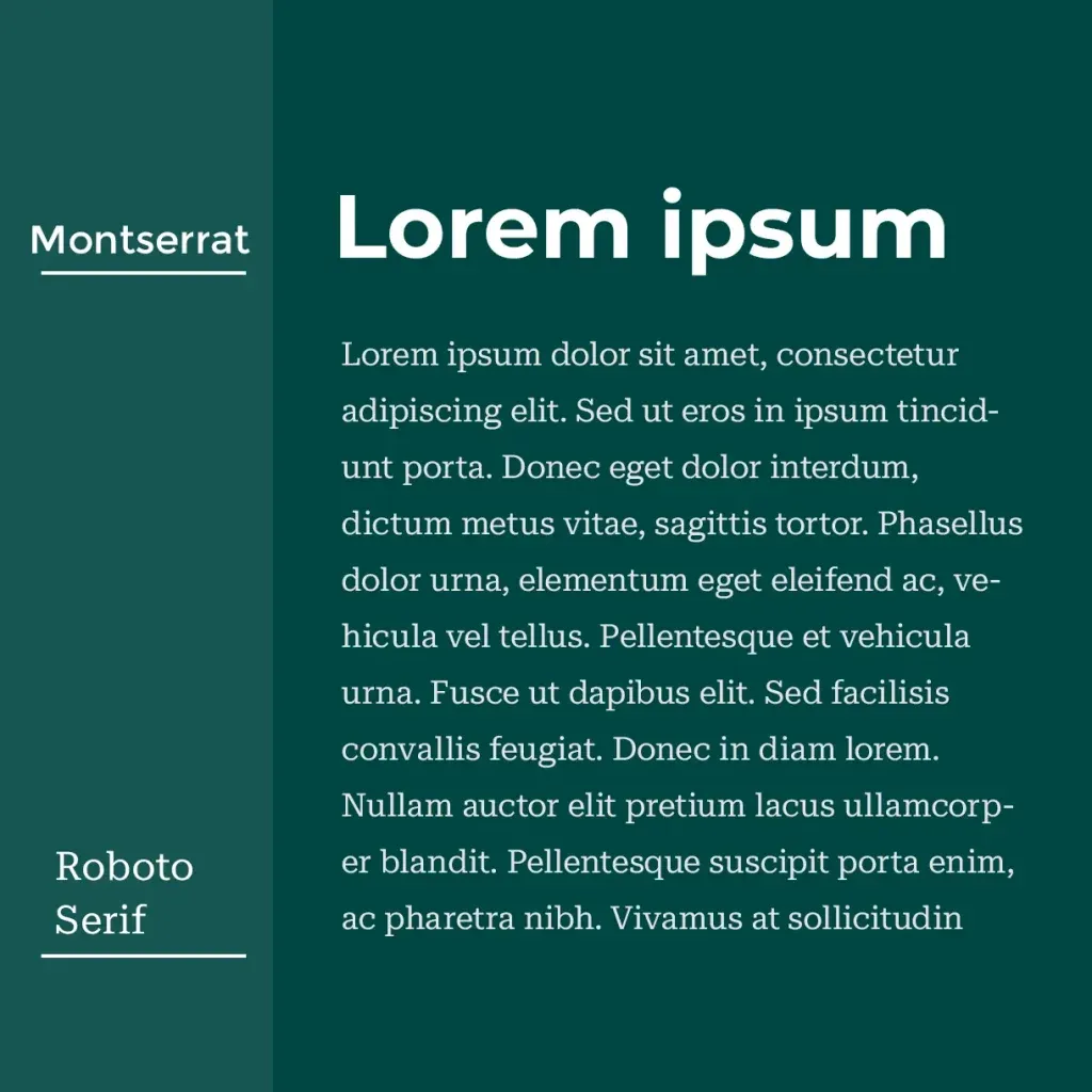
Perfect font pairing 3: Roboto Serif and Montserrat
An elegant pair: Roboto serif + Montserrat = simple refinement.
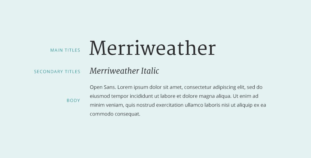
Perfect font pairing 4: Merriweather and Open Sans
This Serif + Sans Serif combo demands attention and delivers on legibility.
Perfect font pairing 5: Source Sans Pro and Playfair Display
Serious, but not too serious. This pairing manages to create charm while looking professional.
Incorporating other languages and right-to-left writing
In a globalizing world, you need to consider diverse languages and right-to-left writing systems to create inclusive and localized designs. Here's how to seamlessly incorporate other languages and implement right-to-left writing:
Incorporating other languages and implementing right-to-left writing is fundamental to designing for a diverse audience. Utilizing tools like Linearity Curve’s design software makes localizing in other languages more accessible.
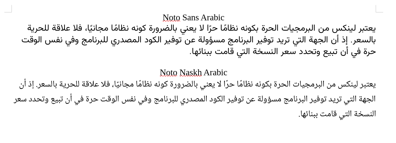
A pairing worth trying is Noto Sans Arabic or Noto Naskh Arabic with SF Arabic.
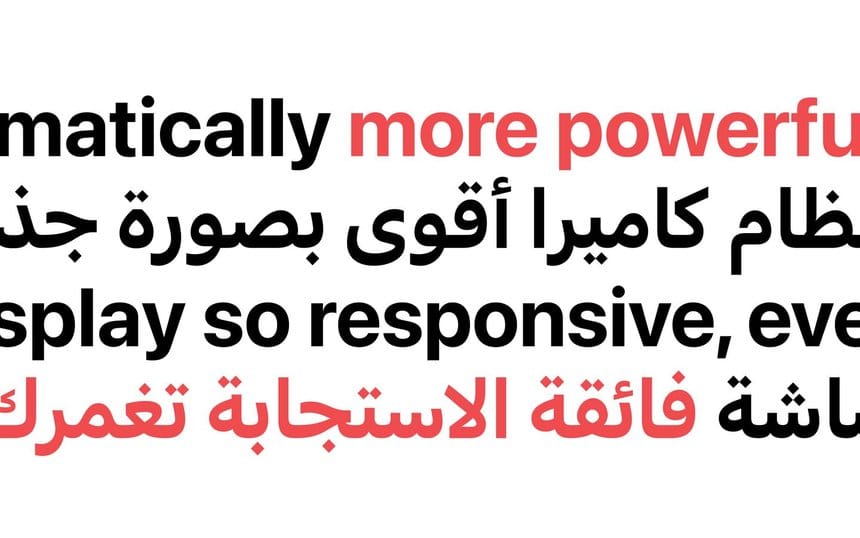
Consider Unicode support, CSS properties, and rigorous testing to create inclusive and localized designs that cater to a global audience.
Achieving perfect font pairing involves mastering design principles and creative flair. Here are some best practices to ensure your font pairings are visually appealing and effective:
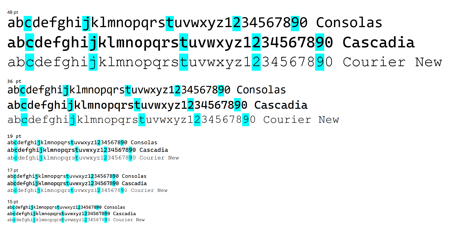
Prioritize readability for a global audience
Remember that readability is paramount when selecting fonts for font pairing, especially when designing for a global audience. Consider using versatile sans-serif fonts for clean body text that diverse readers can easily understand.
Fonts like Roboto, Cascadia, or Helvetica are excellent for maintaining readability. See the example of Consolas, Cascadia, and Courier New below.
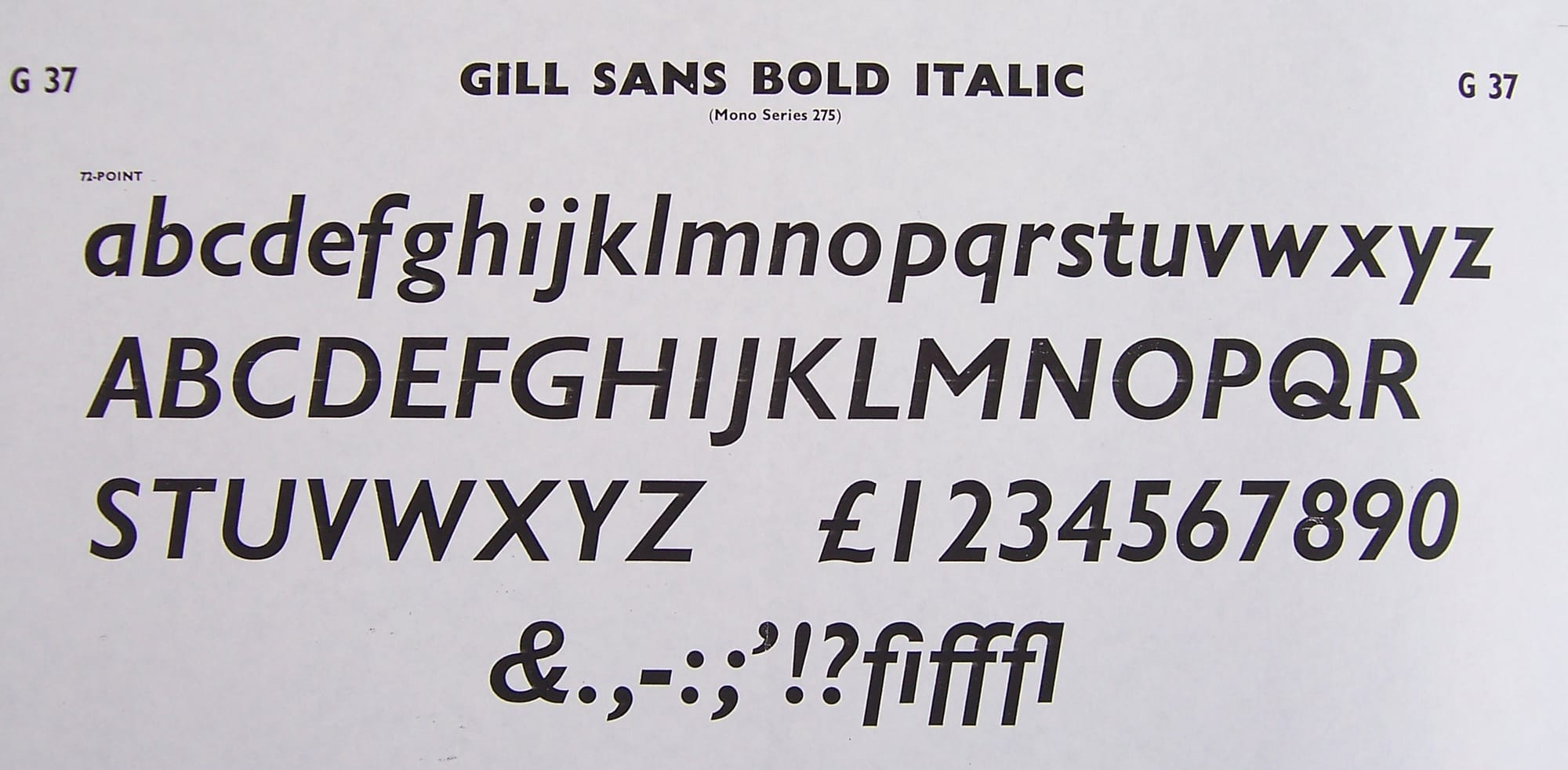
Embrace bold and italics for emphasis
Incorporate bold versions and italicized font styles to emphasize specific design elements. These bold forms and unique characters, like in the Gill Sans font family, can draw attention to important messages or call-to-action sections.
Consider combining traditional and modern typefaces
Explore the juxtaposition of traditional and modernity by pairing classic serif fonts from the 18th and 20th centuries with contemporary sans-serif fonts. Pairing the two creates connection points for contemporary and more traditional audiences, allowing your designs to appeal to a global audience.
Ready to pair up?
Font pairing has a reputation for being complex and challenging to master. But we've shown you that font pairing is just about practice and finding your favorite combinations of fonts.
Have you recently used some great font combinations in your designs? Don’t forget to share them with us on social media and the Linearity Community. Your work can inspire other designers and marketers to find the perfect fonts for their brands.
And if you’re ready for your next design and illustration challenge, head over to our Tutorials section to find more drawing and crafting tutorials.
If you haven’t already, get started for free with Linearity Curve by signing up below. Our powerful design software gives you all the tools you need to create digital and print assets that pop.
Jumpstart your ideas with Linearity Curve
Take your designs to the next level.
Frequently asked questions
How can I create an elegant font pairing for my design project?
Combining classic serif fonts from the 18th or 20th century with modern sans-serif typefaces will help you achieve an elegant font pairing. This juxtaposition of traditional elegance and sleek modernity can result in an elegant and visually appealing design.
What are some visually appealing font pairings for creating a sense of trustworthiness and reliability?
For conveying trustworthiness and reliability, consider pairing classic serif fonts with complementary sans-serif fonts. Baskerville and Helvetica, for instance, is a combination of traditional elegance and modernity that can instill a sense of professionalism and trust in your design
How do I choose the right fonts for right-to-left scripts like Arabic, Hebrew, or Persian?
When designing for right-to-left scripts, ensure that your selected fonts have excellent Unicode support, accommodating unique characters used in these scripts. Test the fonts with sample text to guarantee readability and culturally sensitive design.
What's the key to creating inclusive and localized designs for a global audience?
To create inclusive and localized designs, opt for versatile fonts that support multiple languages and scripts, including Arabic, Hebrew, and Persian. Utilize Unicode to ensure accurate character representation and focus on creating a user-friendly experience.
Can I combine cursive fonts with more traditional fonts in my design?
Absolutely. Incorporating fonts can infuse your designs with layering of meaning. These font choices can enhance specific design elements, so establish a sense of hierarchy while having fun.
What's the best way to ensure a consistent visual hierarchy in my design?
To establish a consistent visual hierarchy, use serif fonts for headlines to create an elegant and visually appealing impact. Complement them with sans-serif fonts for clean body text to maintain a clear and legible hierarchy throughout your design.
Can I customize fonts to make them unique for my brand?
Yes, you can customize fonts to create a unique brand identity. Many fonts allow for modifications such as letter spacing, weight adjustments, and styles like bold and italic. Customization can enhance the uniqueness of your design.
How do I ensure my font pairings are accessible to all users?
Accessibility is crucial. When selecting fonts, prioritize those with good contrast and readability. Use online tools to evaluate your designs for accessibility compliance, ensuring all users can easily engage with your content.
Share this!
Garreth van Niekerk
One of GQ's 'Young Creatives To Watch' and described as a "Creative Force" by the Sunday Times, author, designer and marketer Garreth van Niekerk is a contributor for Linearity in Johannesburg.


