:quality(75))
:quality(75))

:quality(75))
In today’s day and age, a business’s or organization’s web presence is much more than just a collection on web pages or a cool looking app. It essentially functions as a substitute for the primary interaction between consumers and creators. That is why it is so critical to make sure that interactions with your audience and target market go as smoothly as possible.
This is where User Interfaces come in.
Therefore good UI design is imperative not only for a great first impression on users but also for the conversion of potential leads into customers and subsequently even retention of those customers.
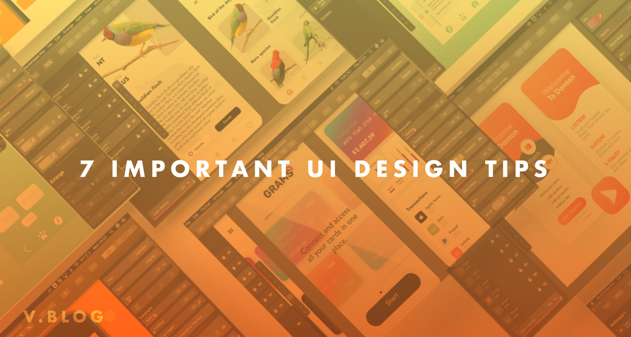
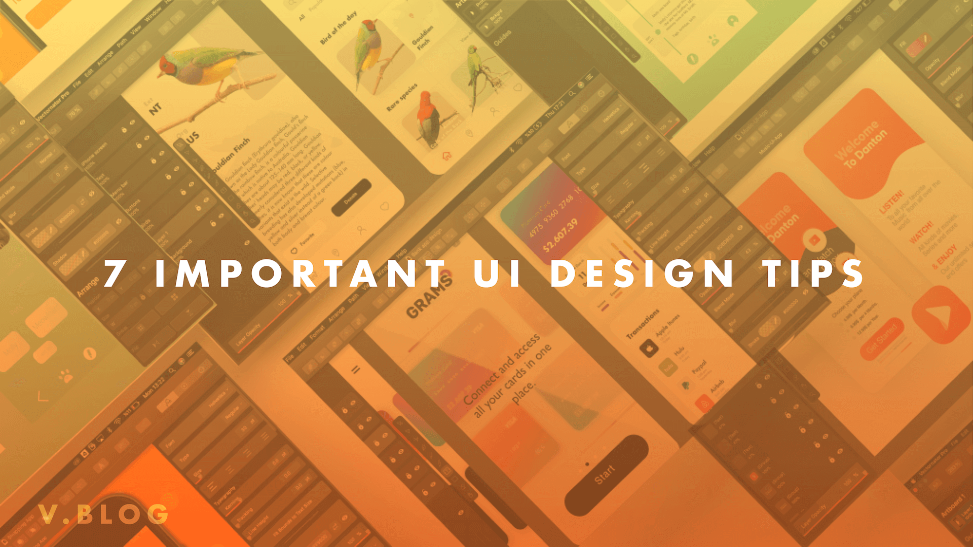
This might seem daunting at first. Don’t worry though! We’ve aggregated and compiled a list of the top 7 things that you need to remember when creating user interfaces. These design tips, which were sourced directly from Human-Computer Interaction (HCI) research have been proven effective for hundreds of designers across many industry domains.
Jumpstart your ideas with Linearity Curve
Take your designs to the next level.
Now, with these simple and straight-forward design tips, you can finally put your users first!
Design tip #1: know and understand your users
Above all else, you must know who your users are. You must know them like the back of your hand. What does that mean?
Before beginning to design an interface, designers need to thoroughly comprehend what their role is in helping users attain whatever it is they need and making sure the users accomplish their goals in the most effective way possible. Attributes of their core demographics such as age, gender, type of content consumed, time spent on website are all crucial data-driven information that will determine the best way to design a UI for these end-users.
As a result, start gathering and analyzing data and don’t hesitate to reach out to your users directly to figure out how you can prioritize your design for them.
Design tip #2: define how users will interact with the chosen interface
Once you know your users, you need to choose the platform you are designing an interface for. Is it a phone or a laptop? Or a desktop? Or perhaps even an Apple Watch? Whatever it is, you need to be sure of it before diving into designing anything.
Once that’s clear, you need to define how users will actually use the interface. Do your users prefer to employ touch techniques more than typing? Do they usually use voice-commands?
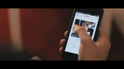
Take Tinder for instance where the UI is focussed around general ease of use by enabling simply swiping right or left on the displayed profiles.
But even that can go wrong sometimes…
Naturally, it’s important to recognize how you want users to use the interface.
What are Direct Interactions?
- Tapping a button
- Swiping on a screen
- Dragging items with fingers
What are Indirect Interactions?
- Using keyboard commands/shortcuts
- Pointing and clicking with a mouse or stylus
- Typing into a form field or document
Here the goal is to focus on who the users are, what devices they use and how they interact with those devices. You wouldn’t have swiping features if your end-users are Seniors with limited tech capabilities. Similarly, you shouldn’t forget to incorporate keyboard shortcuts if you’re designing for programmers or copywriters who heavily rely on them to reduce time-consumed.
Design tip #3: communicate clearly and set expectations
Every interaction on an app or website has a result. A consequence of the action, if you will. Depending on what that button is, clicking a button could lead to you making a financial transaction, sharing location, or making a hilarious comment on your friend’s Facebook picture. The possibilities are endless.
That is why it’s important to communicate to users what exactly each component of your UI does and what the subsequent impact will be.

Some ways you can do that are as follows:
- Highlight the button that corresponds to what the user would ideally want. For instance the “Buy Now” button on E-commerce sites.
- Use symbols. Like a trash can to delete something or a floppy disk to save an item
- Use color. Red draws attention to something important or to stop whereas green means “go.”
- Write a clear copy for the buttons. Describe what the button will do in a simple and concise manner.
- Give warnings or ask for confirmation. Statements like “Are you sure” go a long way!

Twitter’s UI is an example of a simple user-friendly design where users are drawn to the “Tweet” button
Design tip #4: element placement and size
The closer or bigger an element is, the faster it is for the user to get to it in order click or tap on it. This is fairly straightforward. If it’s easy to see and large, people will be able to reach it quickly.
Therefore, designers need to make “click targets” big and position them in an effective manner where best suited. They also need to make sure the most common actions like buying, saving and sharing are large and prominent on the page. A tiny “Buy Now” button before you see the product would make no sense whatsoever. These design tips emphasize knowing what is important and where to locate it.
Ready to create brand assets that pack a punch?
Visit our Academy for free UI design design courses.
These UI design principles are crucial because users are now overwhelmed with information and need to be guided through the process using these techniques. It’s also very important with typography, lists and menus where insufficient space can leave users clicking the wrong buttons.

Always keep your interaction model in the back of your mind. If users scroll vertically, you need to incorporate that into your user design philosophy in order to effectively provide cues and elements.

This UI created with Vectornator illustrates the effective use of button placement, size, and color to direct users.
Design tip #5: make your interface easy to learn
What’s better than designing something that users learn after just using it once? If you’re a designer, practically nothing.
The simpler something is, the easier it is to learn and remember in the short-term. It doesn’t take a scientist to figure that one out yet so many interface designs are not able to pull this off. So, always try and break down the content/information you are providing the user into small and digestible chunks which will have a greater recall value. You can do this by experimenting using your interface in order to find the most effective and efficient design iteration.

Tinder’s UI is a perfect example of an easy to learn interface.
We all know the feeling of opening Microsoft Word or Excel and seeing the multitude of power tools available to us but only ending up typing or inputting data and using only a few of those tools and techniques. Despite their popularity, Word and Excel do not do a good job of designing a good UI which often leaves users overwhelmed with what tools to find where.
This led to something known as progressive disclosure. This is when advanced features are tucked away on secondary interfaces. This means that only the most useful tools are readily available and easy to access thereby increasing simplicity. This is often seen on website home pages, where concise text introduces a product or feature, then it directs users using a link off to a page where they can read more. This is a best practice for mobile design, where user navigation is always a pressing challenge for designers.

Design tip #6: leverage your data
Of course, user-testing, research, and surveys are incredibly important in guiding decisions on user interface design, but data collected after the launch of a new product of new features is priceless. This is because you have credible information about how effective your design strategy is. Are users easily able to navigate from the home screen to the product page? How many conversions are you getting? Have sales increased after a redesign implementation?
:quality(75))
:quality(75))
There is no lack of tools out there which will help you monitor the actions users are taking on your website, their behavioral patterns, session times, traffic sources and more. These insights are invaluable and can not be ignored.

So, set up analytics on your website and begin tracking these metrics regularly and utilizing that knowledge to design better!
Design tip #7: give feedback
Humans, by nature, love getting feedback. How infuriated have you been when your flight gets delayed and the airline won’t tell you anything. Or when you can’t track your order and don’t know when it will arrive?
Keep users interested and hooked with updates on what’s happening. Use loading icons, give time indicators of how long something might take i.e “5 minutes till the download is complete” or animations when a button is pressed!
Take your UI design to the next level
With these Design Tips, you are now well-equipped to create amazing UI that your users will love!
Vectornator is a graphic design software that will help you to get started with your UI creation process. It is a vector-based design tool that suits the needs of businesses, designers, students as well as beginners and enables them to make powerful interfaces for any application. Download Vectornator now on your Apple device and apply our inspiring design tips
Please feel free to ask questions, give feedback, and share your ideas or design tips with us! We are always happy to connect with members of our community.
If you enjoy using Vectornator, please rate the App and share your review. Thank you for being part of our community! ❤️
Jumpstart your ideas with Linearity Curve
Take your designs to the next level.
Share this!
Ben Barnhart
Ben is a Content Lead for Linearity living in Berlin. His hobbies include board games, cooking, reading, and writing.